Back to Graphic Art
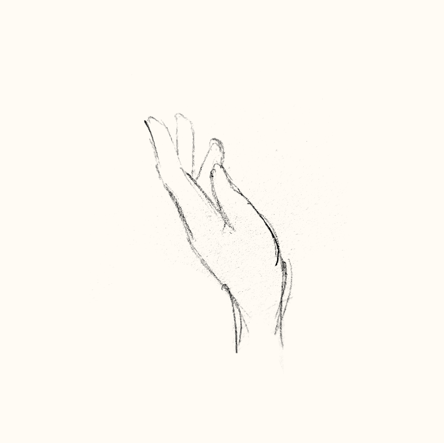
For a freelance client, I was tasked with creating a logo mark for a small business selling handmade herbal scents and sprays. They asked for hands to be implemented in the design, and for the colors to be elegant and gentle. I started with an initial sketch of a hand by photo reference and stylized it from there.


After getting approval from the client to move forward, I brought the drawing into Illustrator. Seeing it in the new context, the swirls (representing the 'scents') seemed excessive to me, so I cut down on their quantity to make the logo mark tighter and less redundant.

Regarding colors, I was initially drawn to a mix of pinks and purples, and found that a type of gold would offset those colors well. While initially my coloring attempts were more pastel, I realized that a higher contrast of colors and values would translate better into print, especially at the smaller sizes needed for the product packaging. In the end, we settled on a palette with the highest contrast between hues and a sharply defined silhouette, with a feminine and elegant touch.

