Back to Print Media
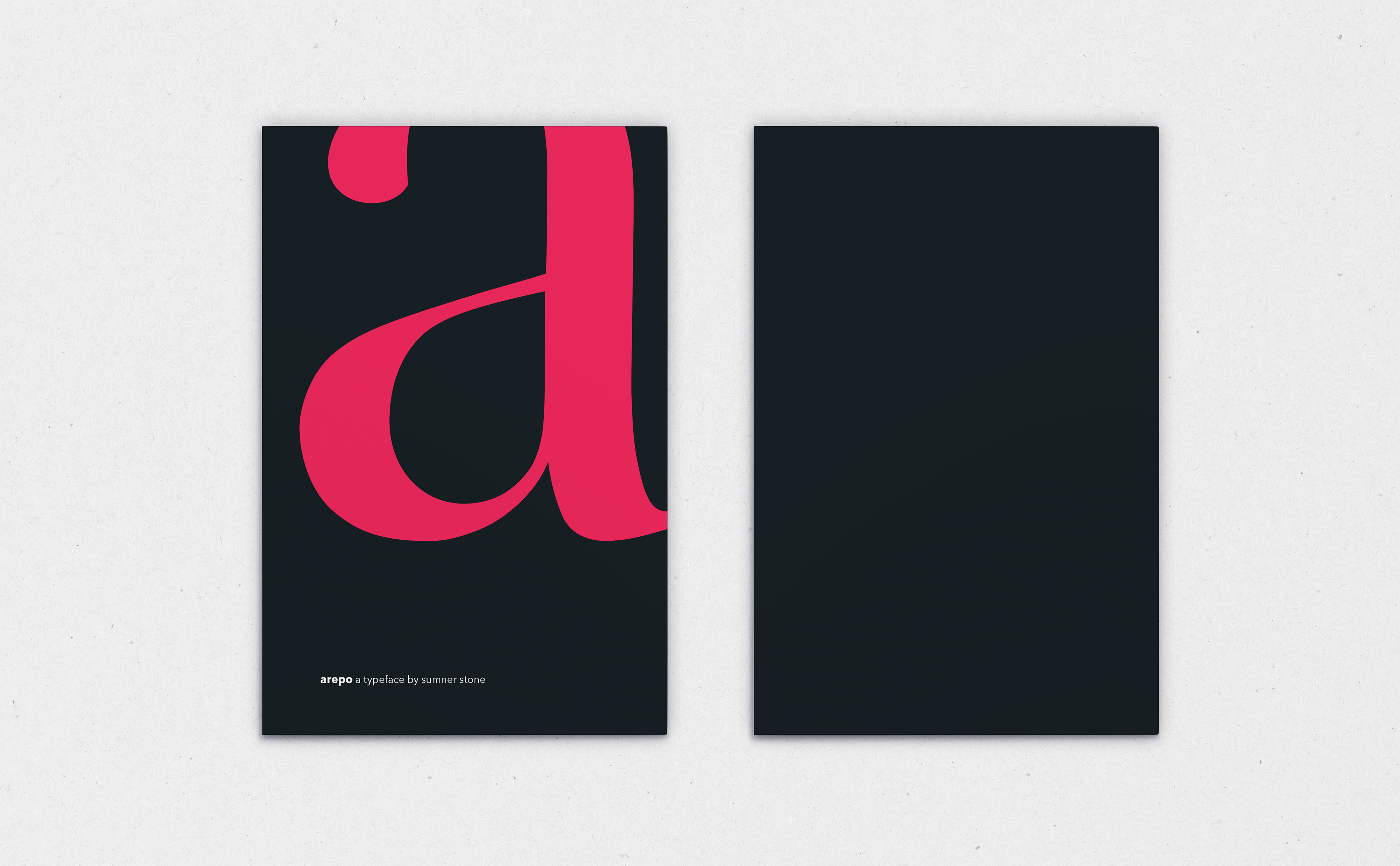
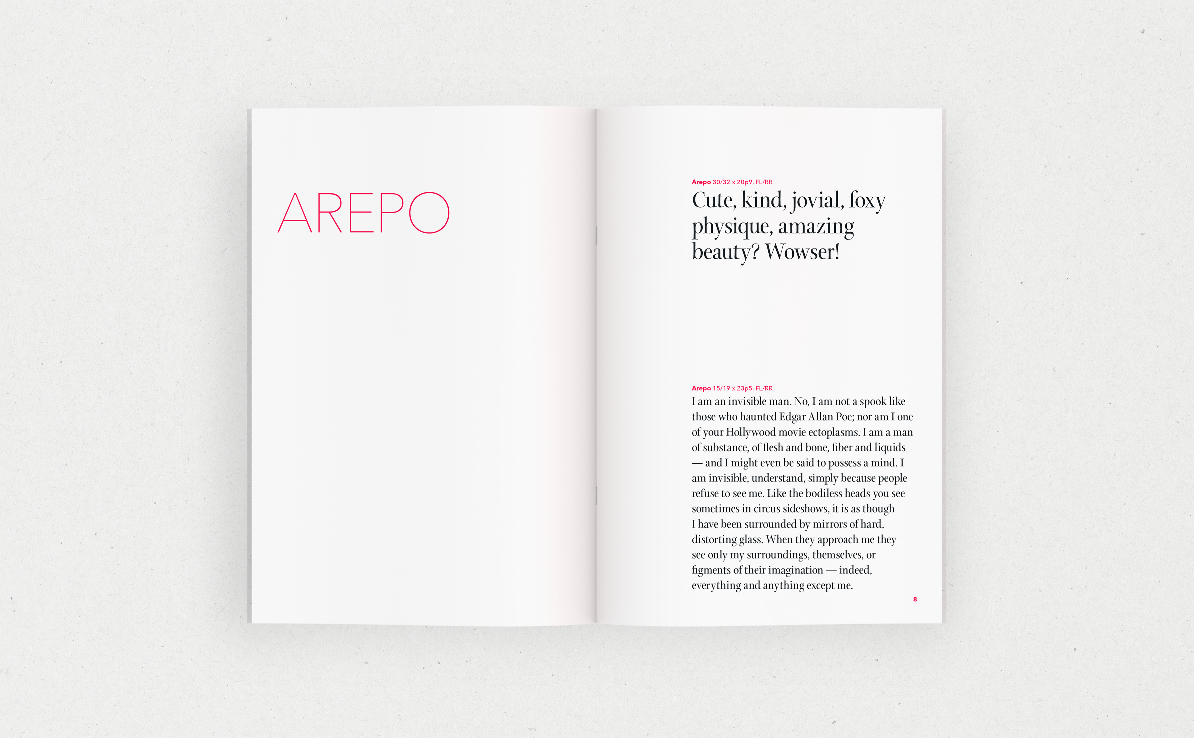
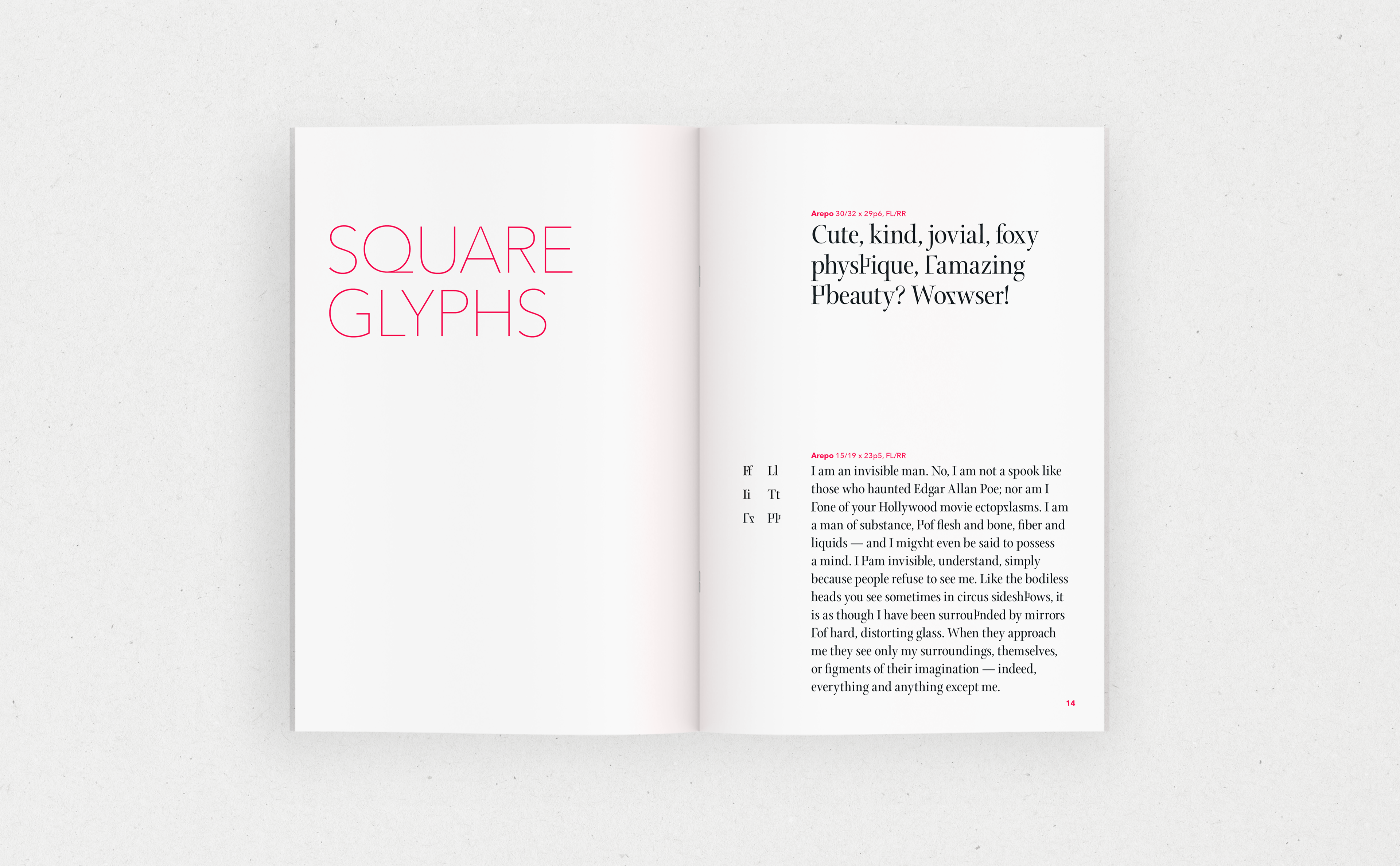
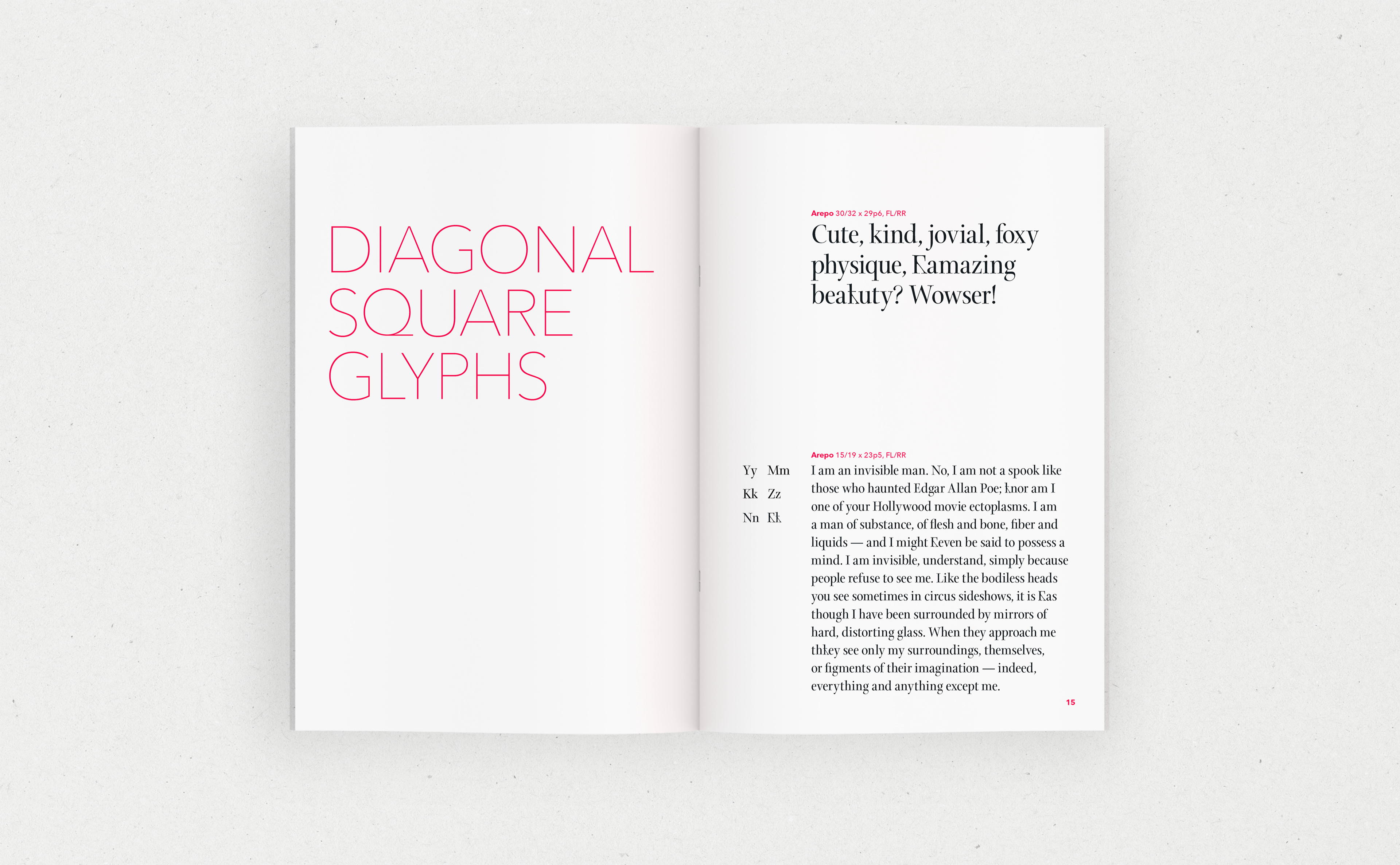
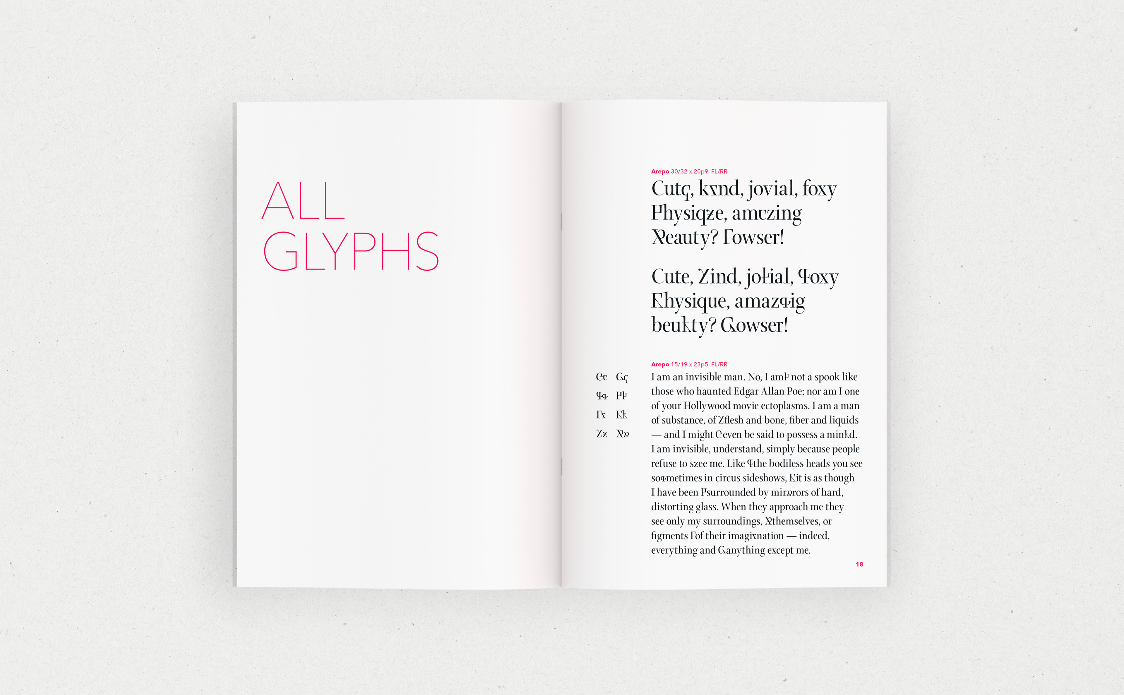
arepo: a typeface by Sumner Stone is a specimen booklet designed by myself that features fictional glyphs. The glyphs are meant to reflect the unique features and personality of Arepo, and are able to fit in amongst existing type forms.
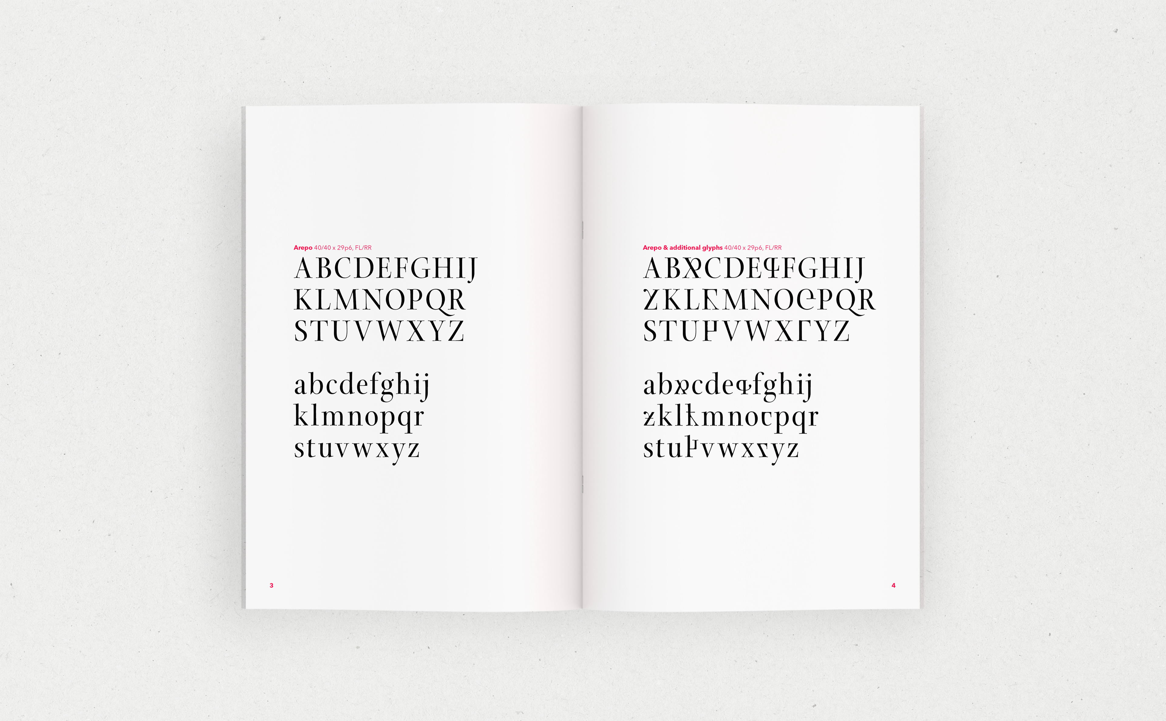
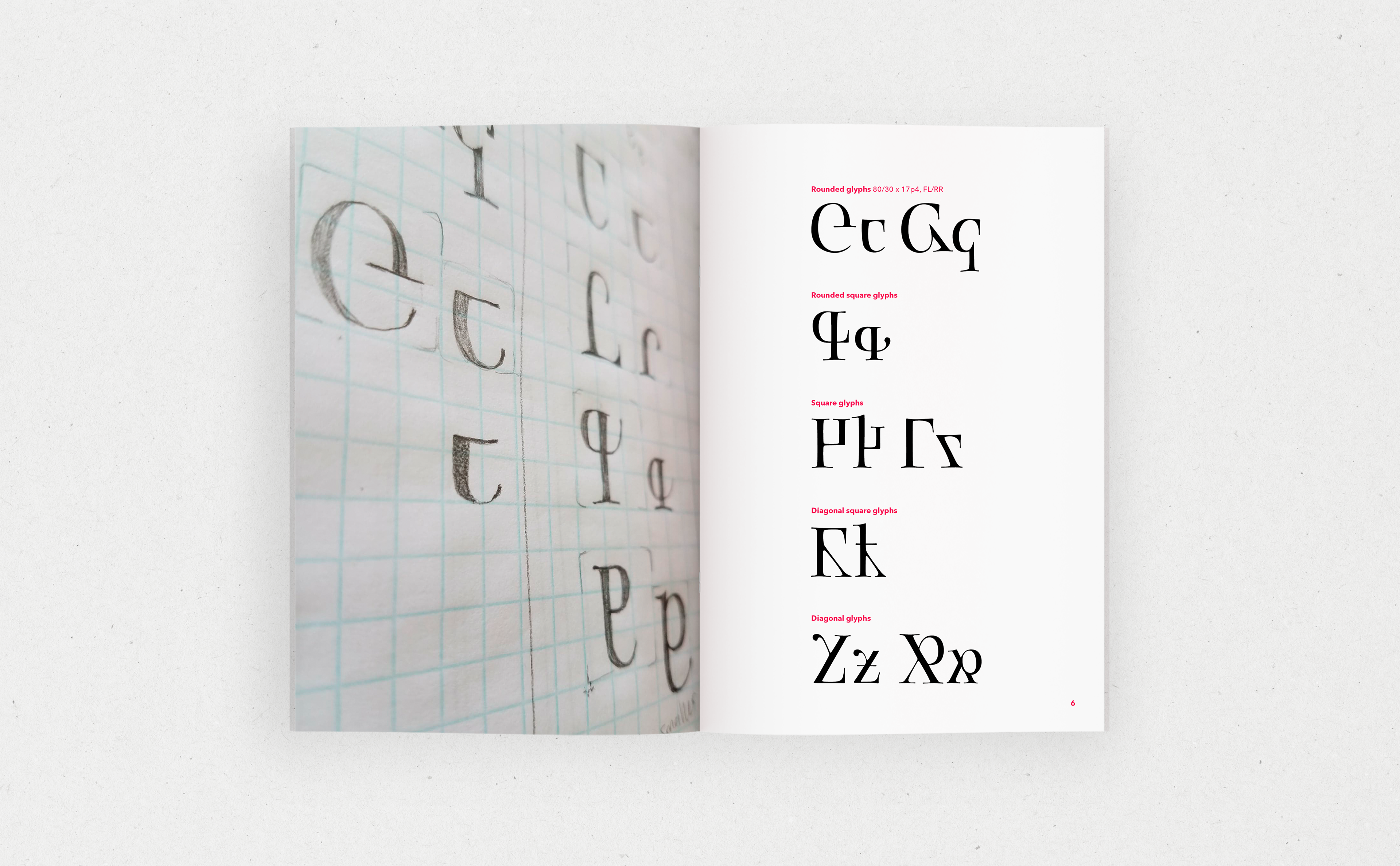
I started the process by creating nonsense forms—characters that had features of English letterforms but were ultimately meaningless. From a select few, I chose letterforms to develop and shape on graph paper, pictured below.
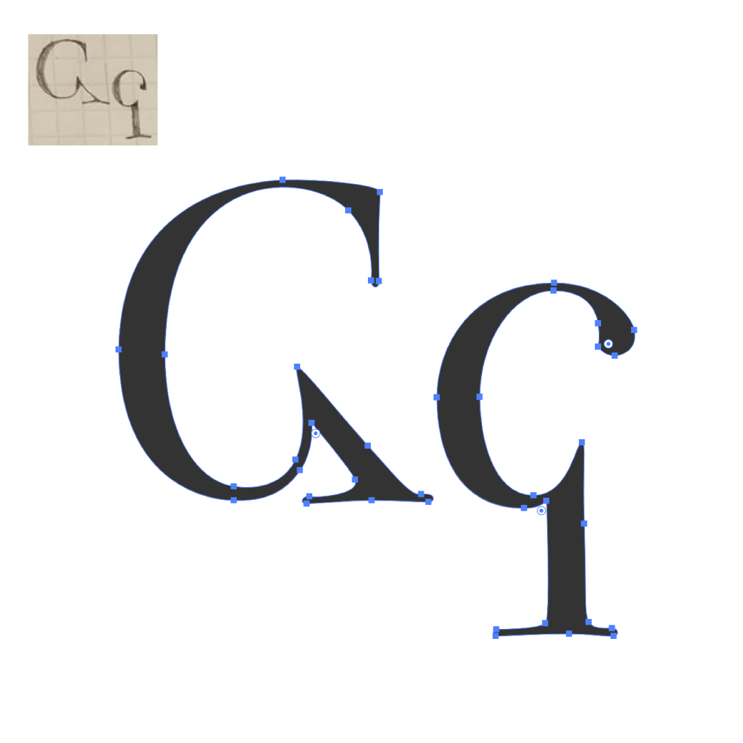

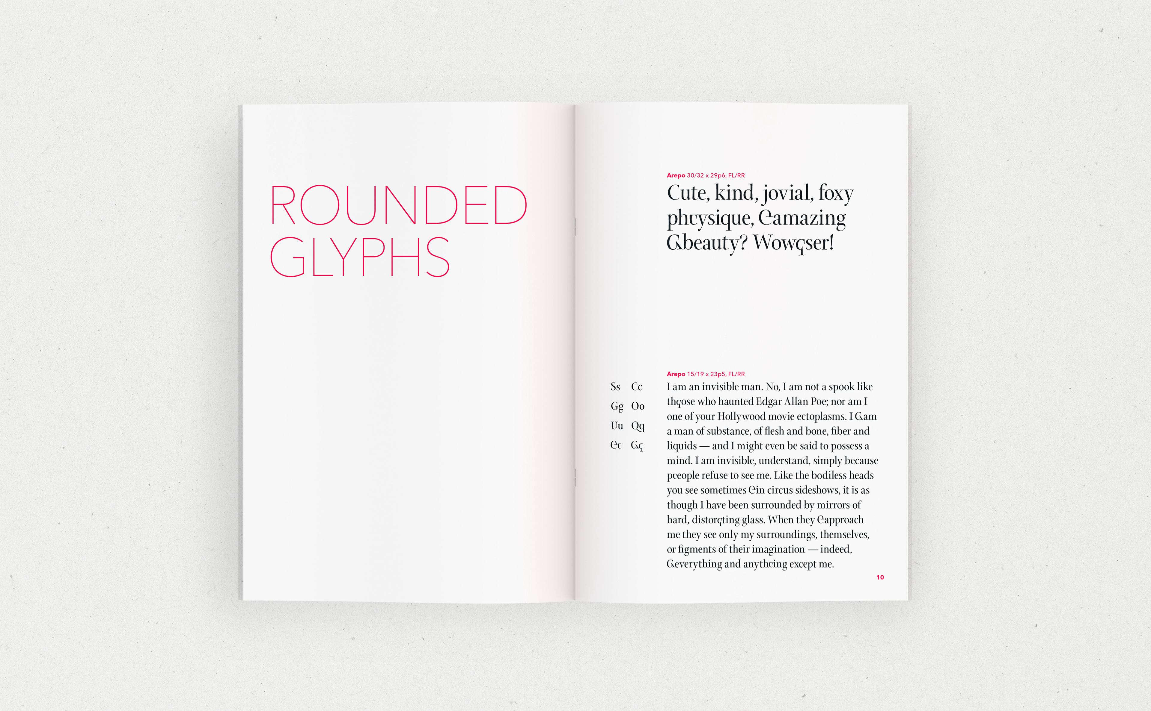
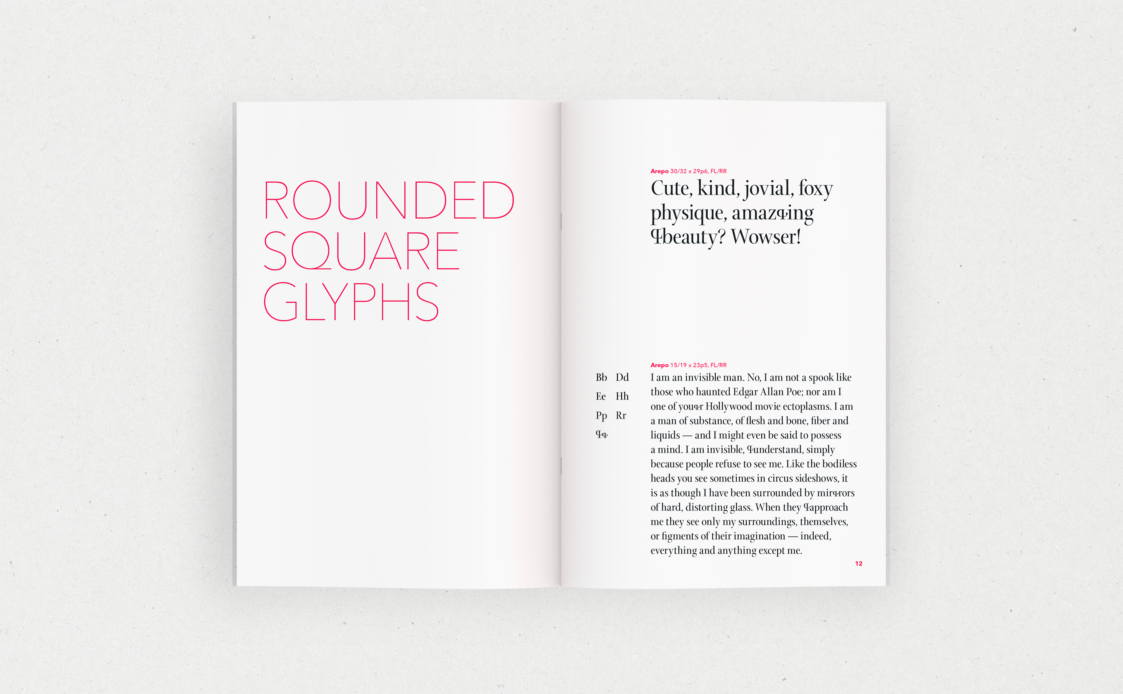
I then brought the forms into Illustrator, further manipulating the balance and weight of the characters to match Arepo. This involved finding similar qualities between characters—serifs and counters, for example—and attempting to imitate them. This process involved balancing the letterforms, weighing them against their existing peers, and inserting them into paragraphs or sentences, something I could do with the font-editing software Glyphs.