Back to Graphic Art
For a motion graphics basics class, I was tasked with storyboarding, designing, and animating a 1 minute tutorial on any subject. I wanted to parody existing digital art tutorials while playing off of the Bob Ross approach to teaching art.
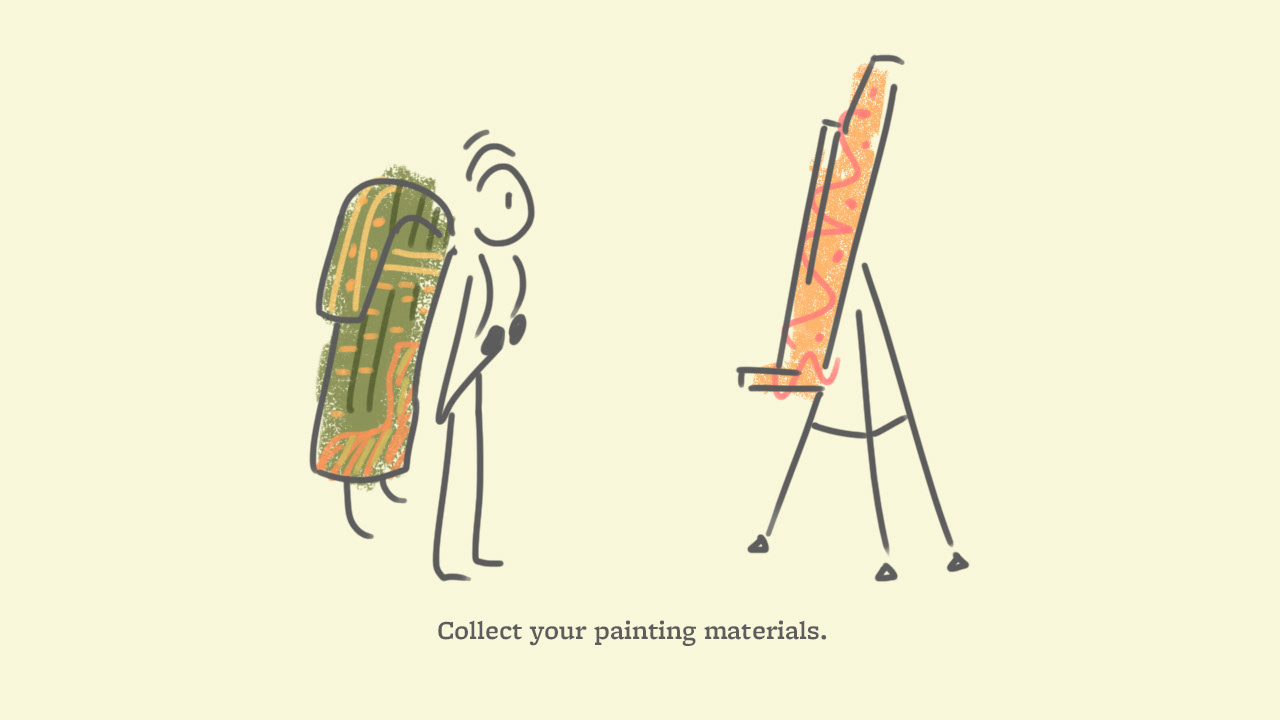
I first needed to establish an illustration style for the animation. I wanted to bring aspects of traditional art into my digital work, but struggled to find ways to integrate them without being overly detailed or time-consuming for an animation. After deciding on the steps of the "tutorial," I drew some stills to see if any of the styles would be ideal for translating into a motion graphic.


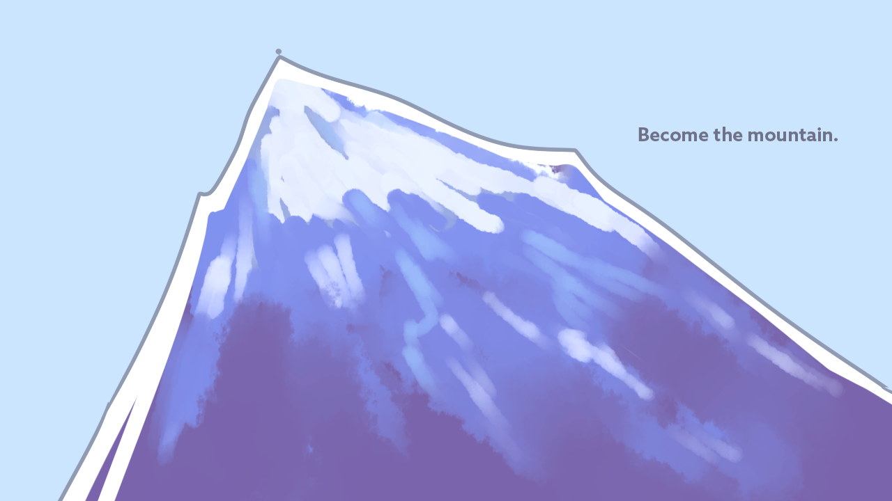
At the time, I was also very interested in working with simple shapes as masks for more complex designs and patterns, so I decided to go with option 4's style. This style was also flexible and forgiving, not requiring the precision that a style with linework would require. The simple shapes I used as masks, such as the ragged triangle shape for the mountain, were meant to be awkward and haphazard, with just enough detail to define objects and scenery.
In setting the type, a sans serif seemed like the ideal solution to compliment the graphic style. The copy for the steps themselves is set in Paralucent, which I felt reflected the assertiveness of the strange instructions. For the main title, I decided to use an overly excitable, flamboyant typeface that sets high expectations for what would, in the end, turn out to be a weirdly unhelpful tutorial.
For the audio, I mixed pieces of Makoto Yoshimori's "Strolling through a Rice Field Path." The song is meandering and light, with sometimes odd instrumentals. I decided on this song early in my process and fit the pacing of the video to it, attempting to match and build on the song's playfulness.
