Back to Graphic Art
As a personal project, I decided to do a fictional logo redesign for Wheaton's Brookside Gardens. The gardens see a variety of visitors, holding educational and art programs for children and adults alike. Hosted annually, the Garden of Lights and the Butterfly Exhibit are two of the most attended events at Brookside. Most visitors are residents of the area, walking or biking on the trails around Wheaton Regional Park, visiting the adjacent dog park, or bringing their kids to the park's playground.
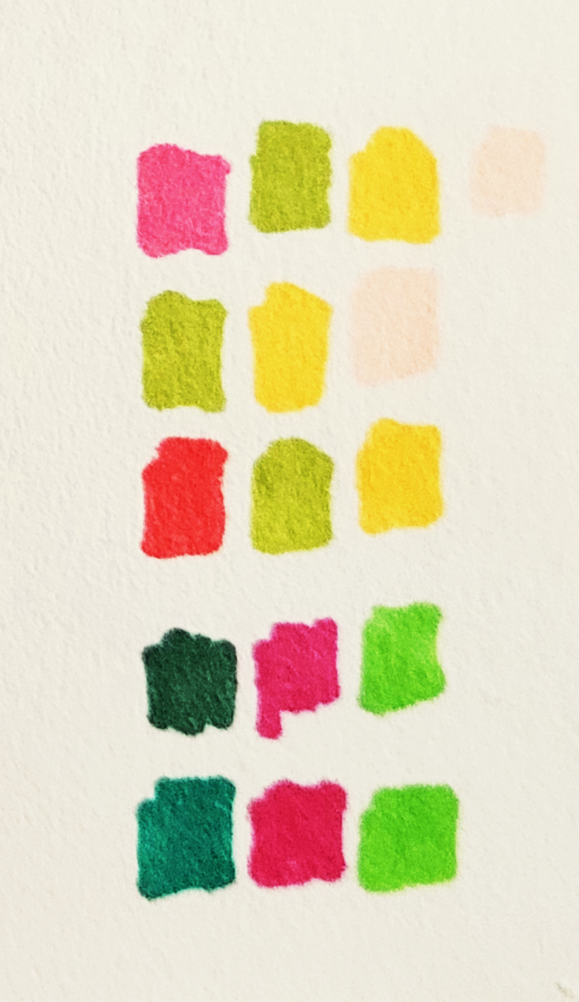
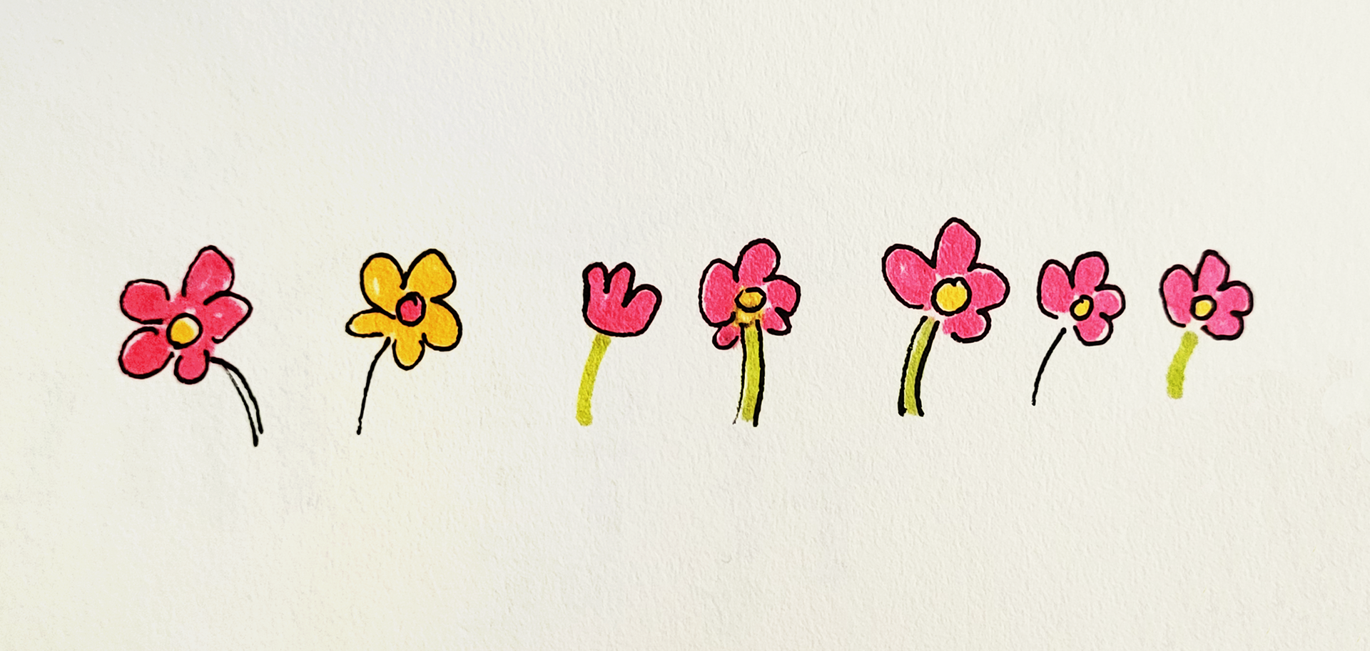
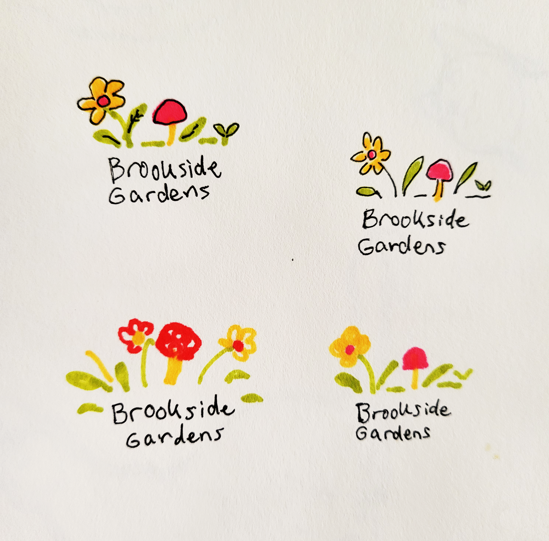
With that in mind, I wanted to highlight the gardens' nostalgic, familiar, and playful nature by using a more illustrative approach. I started with traditional media, working out a layout and elements to use in the logo. With the addition of color, I also considered how the logo could be used in different circumstances, including a knockout version, and how a marker or pen-based logo mark would translate.


For the type, I wanted something that would reflect the weight and character of the logo's lineart, something casual and playful but still legible at smaller sizes. I decided to work off of the typeface billy, recreating the characters so that I would be better able to manipulate them. While working with the type, I opened up the counters of the e's and stabilized some characters so that they would lean less dramatically. Lastly, I flipped the canvas so I could further correct some of the leaning characters to make the balance more centered.

