Back to Social Media
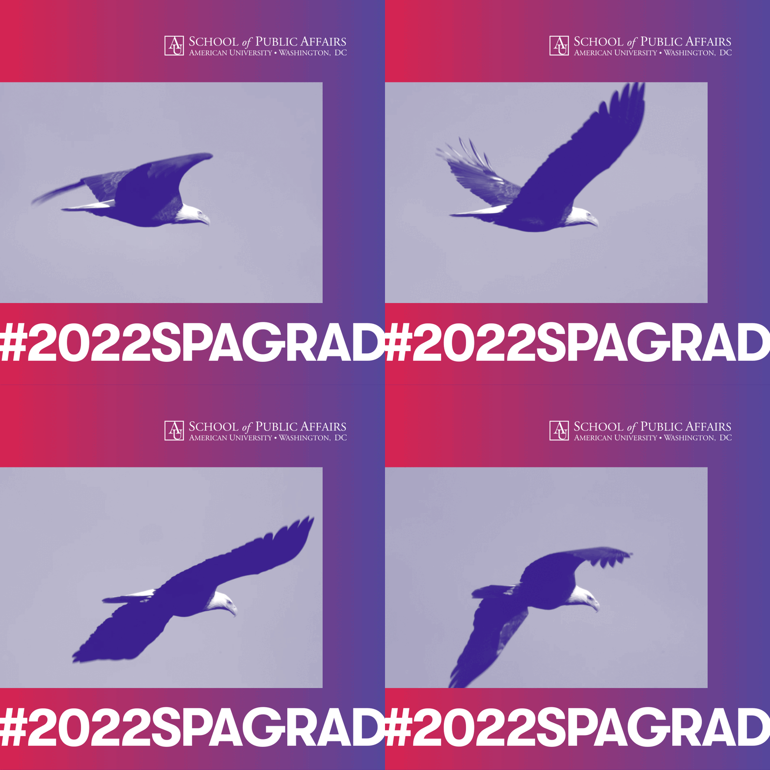
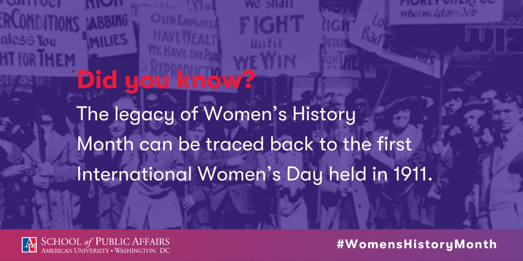
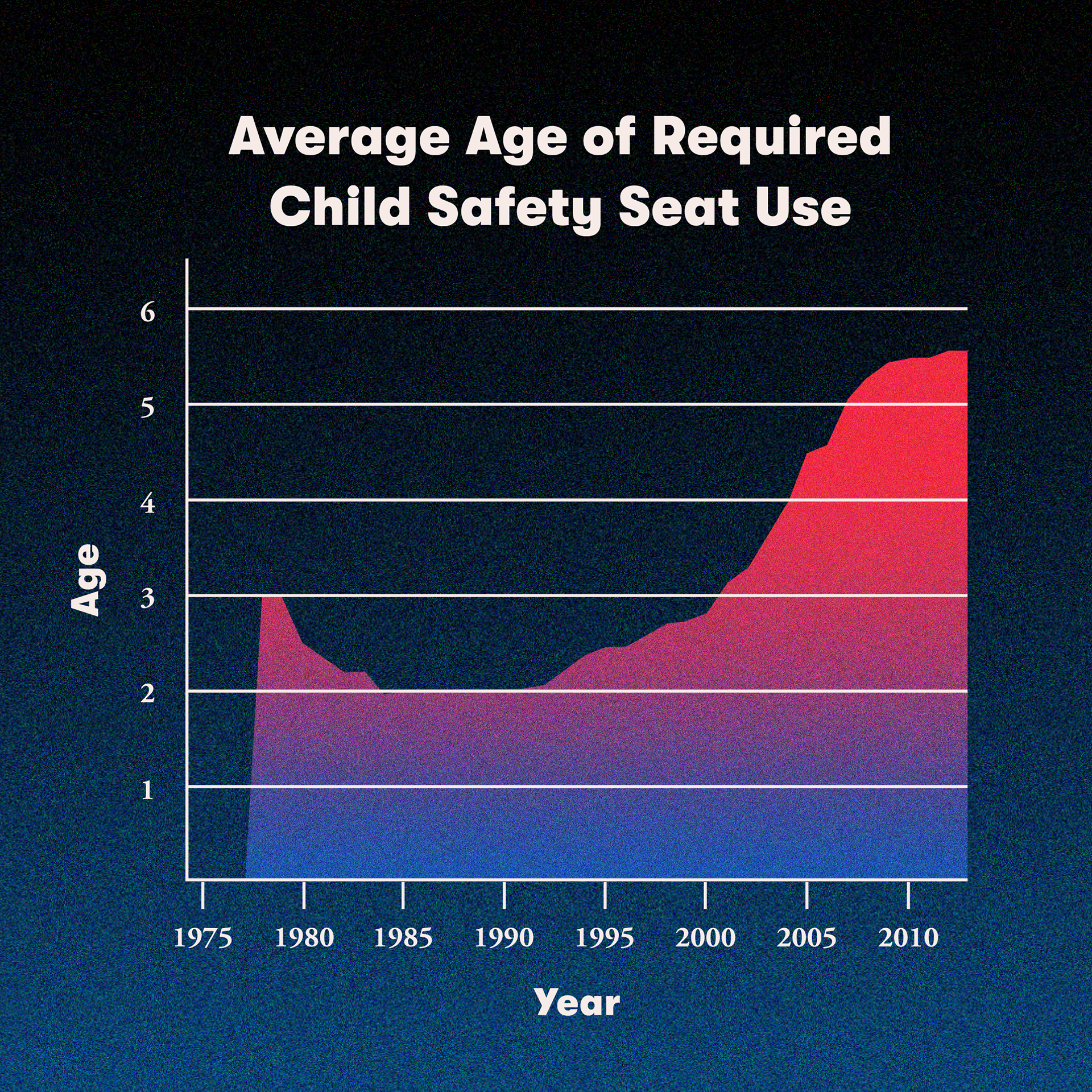
Graphics created for American University's School of Public Affairs social media channels, advertising upcoming events, faculty achievements, and celebratory statements. Almost always, I would create these graphics in different dimensions to be suitable for cross-platform usage.
My priority in creating graphics is always legibility and accessibility. This would often mean setting an exceptionally clear visual hierarchy to show viewers key information, considering the amount of time average users of social media spend processing information in posts. Creating a clear visual hierarchy also means using a minimal range of fonts, so as to minimize visual noise.


